Video Game Reviews – October 2012
Community

Counter-Strike:
Global Offensive
Hidden Path Entertainment / Valve Software
Reviewed on: PC
Also on: PS3, 360, Mac
Street: 08.21
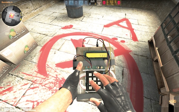
When it takes a company the better part of a decade to release a new installment in an FPS community staple, there’s generally an expectation of improvement. The Counter-Strike series of online competitive shooters hasn’t been updated with a new entry since 2004’s Counter-Strike: Source, allowing a good eight years worth of potential for dramatic improvement. Counter-Strike: Global Offensive starts off great by boasting an updated interface, running on the latest version of Valve’s Source engine. It’s not the world’s prettiest game, mostly owing to Valve stubbornly trying to update Source instead of giving it the complete overhaul it needs, but it’s still an improvement. While the maps are decent enough, half of them are just updated versions of the classics, and the new ones are restricted to the added modes, which themselves are only official versions of the Gungame Community mods that have long been a Counter-Strike staple. The gear and weapons have been updated to reflect modern armament, and character models have new variations, custom-tailored to every map. It’s a nice coat of shiny, new paint, but that’s the most frustrating part: It’s just dated. It’s the best version of the game yet, but it’s the same game. It’s still the exact same, slow-paced, pseudo-realistic competitive shooter that it’s been for eight years. If it had a different art style, or any impressive new features, at least there’d be a case for calling it a sequel, but there’s not enough of a reason for this game to exist. If you’re willing to look past the missed opportunities or you’re a curious newcomer who never played the originals, then you might like Global Offensive and its $15 price point. If you were hoping to see something new brought to the series, though, you won’t find it here. –Matt Brunk
Deponia
Daedalic Entertainment
Reviewed on: PC (Exclusive)
Street: 08.07
Supported by incredible art direction, thoughtful sound design, and genuine comic charm, Deponia manages to feel like a fully unique adventure in the point-and-click style, while still looking back at its roots in the genre. Despite a few strange translations, Deponia’s script is witty and clever, with a cast of voice actors who do a great job of capturing the personality of its vast array of unusual characters. Anyone who’s played a LucasArts adventure game—like the Monkey Island series or Grim Fandango, or even the recent Superbrothers: Sword and Sworcery—knows that the point-and-click adventure genre has incredible potential for storytelling and satire. Daedalic Entertainment often plays with the conventions of adventure games, filling your inventory with pieces of junk that combine in volatile and unpredictable ways and setting objectives in your path that range from something as complex as building a rocket to something as humble as finding a slew of strange ingredients to brew a small cup of espresso. Finn Seliger’s soundtrack sounds like it was pounded out on spoons, car radiators and scrap metal, setting the light, tinkery tone of Deponia’s trash-filled dystopia. Like its main character, Rufus, Deponia is light, funny and content with its own style, tempering its interesting and unique story against an amusing attitude of self-parody. Some of the puzzles are a little obtuse, but if you’re willing to follow Deponia’s twisted logic, you’ll find the journey is well worth the mental gymnastics. –Henry Glasheen


